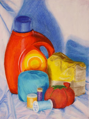
Most of the examples of colour object drawings posted below demonstrate drawing with local colour through a process of layering, colour mixing and editing. Some also demonstrate a depiction of coloured objects with thematic content. For this assignment high lights and shadows should be used but no black should be used to depict shadows.
Editing and Layering with Mediums:
When editing and layering mediums it is extremely important to research and investigate different mediums in terms of what allows for a maximum use of colour mixing. As well research, experiment and investigate on test sheets to determine which drawing mediums are transparent and which drawing mediums are opaque. The opaque drawing materials and mediums will be very useful for covering (layering over) "mistakes". Overall some mediums work better over some than others. For example oil pastel can be used on top of any medium (provided that medium is dry or has dried) but in terms of editing or layering over oil pastel there is not any medium that can be layered on top of oil pastel. So scraping will be required to remove unwanted oil pastel. Experiment and investigate to see how mediums interact when different mediums are combined. You will be required to take risks in order to have progress with this project and other project in the course.
Assignment Objectives:
The majority of examples below demonstrate observational drawing using strategic use of colour (colour in relation to mixing and considering full ranges of hues: primary, secondary, tertiary colours, as well as tints, neutrals, complimentary and analogous colour systems, pure/intense and muted colour) Most of the posted examples demonstrate a focus on local colour with the optical mixing or physical mixing of colour systems.
In addition to the strategic use of colour, selective use of detail, contrast (and lack of contrast), range of sharp and soft edges are all used to convey spatial characteristics of the objects.
Proportions will be a consideration but thematic content, illusion of local colour, mass and space will be the primary concerns for the thematic colour objects drawing assignment. The drawing must contain a strong sense of thematic content with objects communicating substantial meaning and or layers of metaphor and or symbols and or narrative, etc. (see description of thematic content from the "What is Contemporary Art Assignment?" from beginning of course)"What is Contemporary Art?"
This assignment should not present any cliche imagery or ideas. This assignment is about trying to depict still-life in a representational (realistic) way with objects that have substantial thematic content. It is important for everyone in this assignment to strive and eventually achieve layered thematic content in a unique and original way.
 Oil Pastel
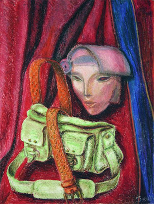
 This Chalk Pastel above is a good example of objects with thematic (or in this case symbolic) content. The crucifix is a loaded icon which in this example might be used in a slightly cliche sort of manner and formally there is far too much use of black, but the composition is very good. Overall the the objects collectively begin to convey a good thematic drawing.
 Chalk Pastel and Conte
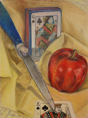
The above example is a very good start for a thematic drawing. Issues of gender, conflict and perhaps power and wealth are presented in the above work.


The five examples of colour object drawings posted below convey very little in terms of thematic content but do demonstrate drawing with local colour through a process of layering, colour mixing and editing.
The majority of examples demonstrate a strategic use of colour (colour in relation to mixing and considering full ranges of hues: primary, secondary, tertiary colours, as well as tints, neutrals, complimentary and analogous colour systems, pure and muted colour) Most of the posted examples demonstrate a focus on local colour with the optical mixing or physical mixing of colour systems.
In addition to the strategic use of colour, selective use of detail, range of sharp and soft edges are used to convey spatial characteristics of the objects.
Proportions will be a consideration but thematic content, illusion of local colour, mass and space will be the primary concerns for the thematic colour objects drawing assignment.


Below is Information Regarding Colour and Colour Theory that is applicable to the Thematic Colour Objects Assignment and is also applicable to all future colour assignments in the course:
The Double Primary Colour Wheel and Information on Colour
The Double Primary Colour Wheel below presents 3 rings of colour along with the warm and cool primaries (double primaries). The two inner rings of the wheel are colours created by mixing various percentages of complimentary colours. These neutral colours that are derived from mixing complimentary colours can allow for a huge range of options when considering colours for shadows and variations of light when depicting planes and mass. In most cases black will not be required if these neutral colours and analogous colours are considered.

Additional Information regarding colour theory and colour systems that should be used in all assignments for class:
Definitions
 Complimentary Colour: Hues that are located directly across each other on the colour wheel. When complimentary colours are placed beside each other they optically create a greater sense of intensity in the coupled hues. This allows for greater contrast within an area of a drawing/painting. When the complimentary colours are mixed this neutralizes any hue and the intensity of the hue decreases, which may also be used to decrease contrast within an area of a painting. Collectively this becomes essential to a drawing/painting when considering the "push and pull" of colour and shapes within a drawing/painting.
 Analagous Colour: Hues that are beside each other on the colour wheel. - Often this colour system can replace or augment the use of white (tinting hues) or when using neutrals (such as browns, grays, blacks, etc) Overall the use of analagous colour presents a sophisticated approach when depicting highlights or shadows in the hue of a coloured shape or space. When using the proper primaries (as demonstrated in the double primaries colour wheel) analgous colours/hues will maintain their intensity.
 Value in Colour
 Value and Intensity
 Three Dimensional Model illustrating what is often considered the three characteristics of colour (Hues, Neutrals and Value)
 Mixing Black (and other Neutrals) into pure hues of colour
For further information on colour mixing and colour theory see:
Colour: an Introduction
AND
Terminology of Colour Mixing
Editing and Layering with Mediums:
When editing and layering mediums it is extremely important to research and investigate different mediums in terms of what allows for a maximum use of colour mixing. As well research, experiment and investigate on test sheets to determine which drawing mediums are transparent and which drawing mediums are opaque. The opaque drawing materials and mediums will be very useful for covering (layering over) "mistakes". Overall some mediums work better over some than others. For example oil pastel can be used on top of any medium (provided that medium is dry or has dried) but in terms of editing or layering over oil pastel there is not any medium that can be layered on top of oil pastel. So scraping will be required to remove unwanted oil pastel. Experiment and investigate to see how mediums interact when different mediums are combined. You will be required to take risks in order to have progress with this project and other project in the course.
Assignment Objectives:
The majority of examples below demonstrate observational drawing using strategic use of colour (colour in relation to mixing and considering full ranges of hues: primary, secondary, tertiary colours, as well as tints, neutrals, complimentary and analogous colour systems, pure/intense and muted colour) Most of the posted examples demonstrate a focus on local colour with the optical mixing or physical mixing of colour systems.
In addition to the strategic use of colour, selective use of detail, contrast (and lack of contrast), range of sharp and soft edges are all used to convey spatial characteristics of the objects.
Proportions will be a consideration but thematic content, illusion of local colour, mass and space will be the primary concerns for the thematic colour objects drawing assignment. The drawing must contain a strong sense of thematic content with objects communicating substantial meaning and or layers of metaphor and or symbols and or narrative, etc. (see description of thematic content from the "What is Contemporary Art Assignment?" from beginning of course)"What is Contemporary Art?"
This assignment should not present any cliche imagery or ideas. This assignment is about trying to depict still-life in a representational (realistic) way with objects that have substantial thematic content. It is important for everyone in this assignment to strive and eventually achieve layered thematic content in a unique and original way.
 Oil Pastel
  This Chalk Pastel above is a good example of objects with thematic (or in this case symbolic) content. The crucifix is a loaded icon which in this example might be used in a slightly cliche sort of manner and formally there is far too much use of black, but the composition is very good. Overall the the objects collectively begin to convey a good thematic drawing.
 Chalk Pastel and Conte
The above example is a very good start for a thematic drawing. Issues of gender, conflict and perhaps power and wealth are presented in the above work.


The five examples of colour object drawings posted below convey very little in terms of thematic content but do demonstrate drawing with local colour through a process of layering, colour mixing and editing.
The majority of examples demonstrate a strategic use of colour (colour in relation to mixing and considering full ranges of hues: primary, secondary, tertiary colours, as well as tints, neutrals, complimentary and analogous colour systems, pure and muted colour) Most of the posted examples demonstrate a focus on local colour with the optical mixing or physical mixing of colour systems.
In addition to the strategic use of colour, selective use of detail, range of sharp and soft edges are used to convey spatial characteristics of the objects.
Proportions will be a consideration but thematic content, illusion of local colour, mass and space will be the primary concerns for the thematic colour objects drawing assignment.


Below is Information Regarding Colour and Colour Theory that is applicable to the Thematic Colour Objects Assignment and is also applicable to all future colour assignments in the course:
The Double Primary Colour Wheel and Information on Colour
The Double Primary Colour Wheel below presents 3 rings of colour along with the warm and cool primaries (double primaries). The two inner rings of the wheel are colours created by mixing various percentages of complimentary colours. These neutral colours that are derived from mixing complimentary colours can allow for a huge range of options when considering colours for shadows and variations of light when depicting planes and mass. In most cases black will not be required if these neutral colours and analogous colours are considered.

Additional Information regarding colour theory and colour systems that should be used in all assignments for class:
Definitions

 Complimentary Colour: Hues that are located directly across each other on the colour wheel. When complimentary colours are placed beside each other they optically create a greater sense of intensity in the coupled hues. This allows for greater contrast within an area of a drawing/painting. When the complimentary colours are mixed this neutralizes any hue and the intensity of the hue decreases, which may also be used to decrease contrast within an area of a painting. Collectively this becomes essential to a drawing/painting when considering the "push and pull" of colour and shapes within a drawing/painting.
  Analagous Colour: Hues that are beside each other on the colour wheel. - Often this colour system can replace or augment the use of white (tinting hues) or when using neutrals (such as browns, grays, blacks, etc) Overall the use of analagous colour presents a sophisticated approach when depicting highlights or shadows in the hue of a coloured shape or space. When using the proper primaries (as demonstrated in the double primaries colour wheel) analgous colours/hues will maintain their intensity.
 Value in Colour
 Value and Intensity
 Three Dimensional Model illustrating what is often considered the three characteristics of colour (Hues, Neutrals and Value)
 Mixing Black (and other Neutrals) into pure hues of colour
For further information on colour mixing and colour theory see:
Colour: an Introduction
AND
Terminology of Colour Mixing
No comments:
Post a Comment